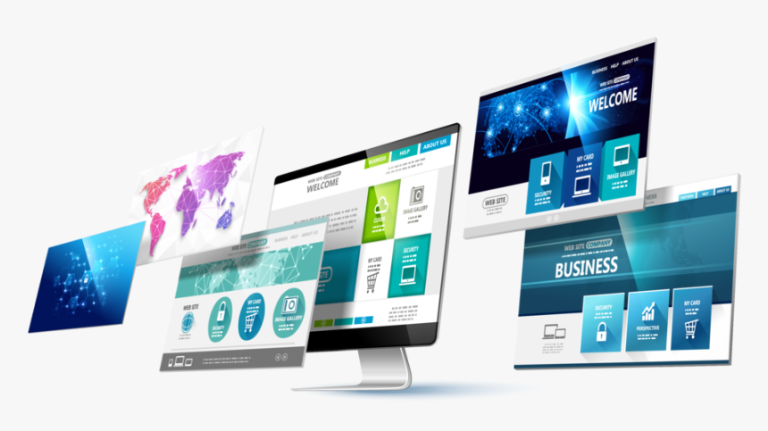
Responsive Website Designing
Responsive Website Design Services In Chennai

Rayafeel Technologies is a web design and development company with expertise in providing a range of responsive web design solutions and responsive web design services. The widespread usage of the internet and the advancement of mobile devices has given rise to the demand for a website that is compatible with a wide range of devices. Responsive web design is the answer to these needs. In this web designing approach, websites are crafted for providing optimal viewing experience on a range of devices. Giving your customers an optimized user experience makes it easy for them to read and navigate with a minimum of resizing, pinching, and scrolling.
Responsive Design prepares websites for the future of up to date website design by making them beautiful crossways multiple devices.
What is Responsive Website Design ?

Responsive designing contains of three development principles:
- Fluid grids
- Flexible images and media
- Media queries
Responsive website design is an only website that adjusts to the devices of each exclusive visitor, whether desktop, smartphone, or tablet. A responsive website with dynamism re-sizes its content and images for a variety of diverse screen sizes to make sure the website is effective and easy to use on any device.

Fluid Grids
It uses comparative sizing to fit the content to the device’s screen size. The term “grid” is a little misleading because it’s not necessary to implement any of the available grid frameworks. Instead, CSS is used to position the content. This method is based on percentages and is a departure from traditional pixel-based design principles. Responsive design moves away from the pixel-based approach because a pixel on one device could be eight pixels on another device. By creating text size, widths, and margins on percentages, a fixed size can be turned into a size relative to its display space. If you are looking for bracelet. There’s something to suit every look, from body-hugging to structured, from cuffs to chain and cuffs.
Media Queries
These are also known as breakpoints, can be used to put on different styles based on the capabilities of the device. The website identifies the type of device you’re using or the size of your web browser and correctly displays the page. To get this in action, give the window of your web browser to different sizes. Notice how the page adjusts. Features can be used to control the width, height, max-width, max-height, device-height, orientation, aspect ratio, etc.
Flexible Images and Media
This allows you to adjust images, videos and other media to consignment differently, depending on the device, either by scaling or using the CSS overflow property.
Scaling in CSS is relatively straightforward—the media element’s max-width can be set at 100 percent, and the web browser will make the image shrink and expand depending on its container.
An alternate to media is to crop it with CSS. Applying overflow: hidden allows images to be cropped dynamically so that they fit into their containers.
